Understanding cognitive principles that make interfaces intuitive and delightful. Discover how visual hierarchy and human perception shape digital success.
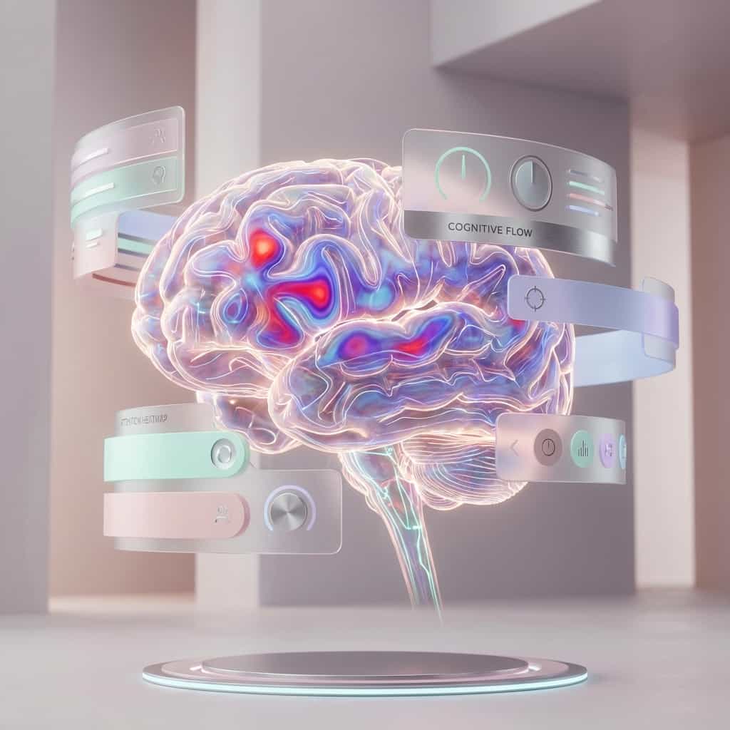
Great design isn't just about aesthetics; it's about how the human brain processes information. When a user lands on your application, they are performing thousands of subconscious calculations every second. A truly great interface works with these cognitive processes, not against them.
Cognitive Load & Simplicity
Hick's Law states that the time it takes to make a decision increases with the number and complexity of choices. This is why "clean" interfaces feel better. It's not just minimalism for style's sake; it's about reducing cognitive load. By presenting fewer, clearer choices, we guide the user to their goal without exhausting their mental energy.
"Design is intelligence made visible."
— Alina Wheeler
The Von Restorff Effect
Also known as the "isolation effect," this principle predicts that when multiple similar objects are present, the one that differs from the rest is most likely to be remembered. This is the science behind the "Call to Action" button. Why is the primary button filled and the secondary button outlined? To exploit this psychological bias and direct attention exactly where we want it.
Familiarity Breeds Comfort
Jakob's Law reminds us that users spend most of their time on other sites. This means they prefer your site to work the same way as all the other sites they already know. While innovation is important, reinventing common patterns (like navigation bars or shopping carts) often leads to friction. The best designers know when to follow convention and when to break it for a moment of delight.